Falling demand, tight credit, and unprecedented economic challenges are forcing businesses to look for tools and means of reducing cost, increasing productivity, maintain-even increase customer base, avoiding costly initiatives, and improve quality. The essence of this initiative, Supply Chain Institute, is to address these problems by providing analytics, modeling capability, and execution methods to assist with the resolving of the real life business problems.
Tag Archives: Databases


Announcement
Greetings All,
In response to industry needs in utilization of captured data and through visibility functions, we will start webinars on creating value by using capturing of selected array of data as BI. This is combined with risk and performance analysis to accommodate for optimality in Operational and Strategic optimality.
Stay tuned,
Dr. Javad Seyed

How Do You Turn Supply Chain Data into Actionable Information?
How Do You Turn Supply Chain Data into Actionable Information?
There is a continuum in terms of presentation of data that allows for continuous sophistication in understanding and interpreting data. There are lots of ways to view data, but three that are particularly useful in supply-chain analytics are –Reporting, Scorecarding, and Benchmarking.
The simplest form of looking at data is what we have all seen dozens of times, we call it “Reporting”. Back in the day, reporting was numbers printed out on green bar paper, but today’s business intelligence reports are far more detailed and dynamic than in the past. For instance, a BI report of today displays all the data about transportation providers as usable information, in a scorecard format. Factors such as on-time delivery, freight cost per unit shipped, and transit time are assigned metrics and weighted averages to help users determine how well carriers are performing overall.
Operation managers and executives who want a quick, daily overview of what is happening in their transportation or supply chain network use dashboards to provide information in near real-time to help users understand what is happening within their network, and allows them to make proactive decisions to remedy problems as they occur. Where reporting is really like looking in the rearview mirror, dashboards are used to see what’s going on now, and makes it easier for users to identify trends and exceptions, and to intervene before something goes wrong.
Do you have any questions about this topic? Send us a message or leave your comments below.
Related articles

![Top 10 Supply Chain Schools in the US [SLIDESHOW]](http://supplychaininstitute.com/wp_sci/wp-content/uploads/2014/09/272851471_80_80.jpg)


Leverage cloud financial intelligence systems with AWS
Leverage cloud financial intelligence systems with AWS
The use of cloud financial intelligence systems, typically from cloud financial management system providers, offers insights into cloud usage. Cloud financial management providers, such as Cloud Cruiser and others, can tell you how effective the cloud platforms are in delivery of services. This includes how each service tracks back to cloud resources that support the services, as well as who is consuming the services and by how much.
However, the true value of these systems is not the simple operational cost data that they are able to gather and report on — it’s the ability to leverage deeper analytics to determine usage patterns, and how those patterns will behave over time. This means you have the ability to better understand how your AWS instances (and other cloud services) were put to use in the past, and more importantly, how they will be leveraged in the future, including the ability to properly estimate cloud resource utilization in the context of complex and widely distributed architectures.
It’s all about the ability to make the most out of data from multiple components of the architecture, not just AWS. Most enterprises that deploy cloud-based systems do so using either public and private clouds within a multi-cloud architecture, which may also be mixed with traditional (or legacy) systems. This makes the financial tracking much more complex, but also much more valuable.
For example, a production management system may leverage core storage services from AWS, session management services from their OpenStack private cloud and core database services using a traditional Oracle database running in their data center. Thus, the cloud financial management system needs to gather information for many different system components, including the private and public clouds , as well as the local database. System owners can use this information to determine the amount of resources consumed, as well as patterns of consumption over time. They have a complete picture as to how a holistic system is functioning, including cloud and non-cloud components.
If you have any opinions or suggestions, leave your comments below. Please do not hesitate to contact us via e-mail and subscribe this blog.
Related articles


The Difference Between Infographics, Instructographics and Data Visualisations
The Difference Between Infographics, Instructographics and Data Visualisations
Infographic is a well-known term in the marketing world, but what are data stories and instructographics? There is some debate about the differences between them all, especially when it comes to data stories, also known as data visualisations, and infographics. Whilst they hold some similarities, there are some key factors which make them quite distinct from each other.
What are infographics?
Infographics are created to tell a story about something. They can be about almost any topic, from how much plastic the world uses to what makes a successful mobile app; but they are always aimed at a specific audience. Essentially, if you have some interesting facts or data to share, infographics are the most accessible way to do it. They’re clear, look attractive and are therefore very shareable. Although your audience enjoys evergreens and blogs, remember that they often don’t have time to read the whole thing. An infographic provides a neat summary of the information they need to know, so they can be a welcome break from the walls of text they see all day, every day.
How do instructographics differ?
Instructographics usually cover a DIY task, but again, they can cover almost any topic. Just like an infographic, they have the potential to go viral and are made to look as attractive as possible. Although a well-written ‘how to’ guide can cover much more information than an instructographic, they often aren’t as visually appealing or easy to follow.
…and data visualisations?
Data visualisations are much like an unrefined infographic. They present quantifiable information and so are more likely to focus on numbers. In some cases, an entire data set is shown without editing and they rarely take a lot of handiwork to produce. They are much more likely to be generated by computer programs using algorithms, as their overall look isn’t too important.
Please leave comments below if you have opinions. You may also send us a message.
Related articles

![How to Become a Google Plus Wizard [INFOGRAPHIC]](http://supplychaininstitute.com/wp_sci/wp-content/uploads/2014/09/263501645_80_80.jpg)


The TOFU (Top of Funnel Users) Approach to Business Intelligence
The TOFU (Top of Funnel Users) Approach to Business Intelligence
An interesting article in Forbes.com entitled, “Why Top Of The Funnel BI Will Drive The Next Wave Of Adoption”, written by Dan Woods, sparked some great conversations about bottom of the funnel users (20-30% wanting specific business information), and Top of Funnel Users (or TOFU) that want to interact with information in a personalized way and express their interests. I was fortunate to have Matt Milella, Director of Product Development for Oracle Business Intelligence Mobile Apps, and Jacques Vigeant, Product Strategy Director for Oracle Business Intelligence & Enterprise Performance Management, join me for a podcast to discuss their opinions about “The TOFU approach to business intelligence (BI)”.
Jacques explained that the article is basically about how BI has historically focused on what we refer to as the ‘business analyst’ or the ‘power user’. That’s the person in a company that has the unenviable task of analyzing data, finding trends, and synthesizing data into dashboards that he/she then shares with management. The common thinking, in BI companies, is that roughly 20% of the users prepare data that the ‘rest of us’ consume. There are many practical and technical reasons why BI started using this model 30 years ago, but the world of technology has come a long way since then. Today, the average user can do much more with much less help from IT.
Do you think that this article is interesting? Do you have any opinions? Thank you for reading. If you have any questions, send us a messageor leave a comment below.
Related articles

![The Definition of Marketing Automation [In Under 100 Words]](http://supplychaininstitute.com/wp_sci/wp-content/uploads/2014/10/262213529_80_80.jpg)


![Inbound Marketing Funnel Do's and Don'ts [Guide]](http://supplychaininstitute.com/wp_sci/wp-content/uploads/2014/10/148767758_80_80.jpg)
Box Partners With Roambi To Attack The BI Market
Box Partners With Roambi To Attack The BI Market
Box and Roambi just announced a partnership that is both old fashioned and empowering, and may be an accelerator for companies struggling to expand the use of data without creating a mess.
Spreadsheets are at the core of the Top of the Funnel BI challenge that companies all over the world have faced for decades. The challenge defined by TOFU BI (as I’ve discussed in “Why Top of the Funnel BI Will Drive the Next Wave of Adoption”) is how do you get everyone in the enterprise using data to maximum effect.
… the point of this partnership is to keep the wildly popular paradigm of self-service spreadsheets and add a delivery mechanism created for the modern, mobile world. Both Box and Roambi are well suited to solve parts of the problem and work together. Box acts as the repository that helps control the sprawl of hundreds or thousands of spreadsheets and makes them manageable. Roambi Analytics extracts data from spreadsheets and other sources and creates attractive dashboards or e-books (in the Roambi Flow product) that present data in an attractive way. …
If you have any opinions, leave it in the comment box or feel free to send us a message.
Related articles


KB – Neural Data Mining with Python sources
KB – Neural Data Mining with Python sources
The aim of this book is to present and describe in detail the algorithms to extract the knowledge hidden inside data using Python language, which allows us to read and easily understand the nature and the characteristics of the rules of the computing utilized, as opposed to what happens in commercial applications, which are available only in the form of running codes, which remain impossible to modify.
The algorithms of computing contained within the book are minutely described, documented and available in the Python source format, and serve to extract the hidden knowledge within the data whether they are textual or numerical kinds. There are also various examples of usage, underlining the characteristics, method of execution and providing comments on the obtained results.
You are welcome to share your opinion in the comment box below or send us a message.
Related articles


iView Systems’ iTrak® Business Intelligence Delivers Dynamic Dashboard Risk Analytics & Reporting
iView Systems’ iTrak® Business Intelligence Delivers Dynamic Dashboard Risk Analytics & Reporting
iView Systems, a leading provider of loss prevention solutions for the security and surveillance environment, is excited to announce the most recent addition to the iTrak® family of Incident Reporting and Risk Management solutions, the iTrak® BI (Business Intelligence) Module. The iTrak® BI Module delivers powerful dashboard visualizations from information reported in the iTrak Incident Reporting and Risk Management and other data sources in real-time, providing users a visual representation of their incident and other iTrak information. This allows organizations to quickly extract meaningful business intelligence to detect emerging trends & identify risks, threats & vulnerabilities.
iTrak® BI real-time, interactive dashboard reporting and visualization.
- Manages dynamic business data, providing the ability to control the visualization and analysis of data in real-time.
- iTrak® BI is equipped with a large selection of high-quality data controls and visualizations, effectively presenting the data to associated audience.
- Connects and consolidates data into one system, regardless of where your data resides; saving time and money.
- iTrak® BI empowers end-users to create, interpret, analyze and drill down through a wealth of information for effective decision-making in real time.
- iTrak® BI adapts to the business so users don’t have to adapt to the product.
- iTrak® BI gives users a range of viewing options that are designed specifically for both desktop and mobile delivery providing important metrics on the-go.
- iTrak® BI allows communication, collaboration and the ability to take direct action via commenting capability directly on the dashboards – allowing effective and immediate the insight to make better business decisions.
- iTrak® BI Dashboards lets users choose, filter, format and sort metrics they need to see, with the ability to share and collaborate the finished results (mashups) with other users.
- The web-based solution lets users create, view, and interact with dashboards directly in a web browser – with no need to install a separate desktop application.
If you have any question, leave us comments below of send us a message.
Related articles


Magic Quadrant for Business Intelligence and Analytics Platforms
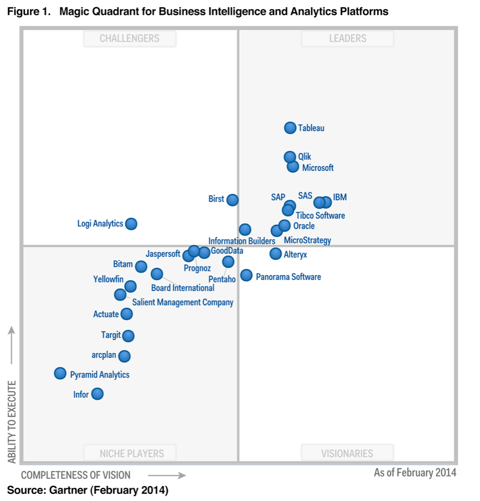
Magic Quadrant for Business Intelligence and Analytics Platforms
Magic Quadrant for Business Intelligence and Analytics Platforms
Data discovery capabilities are dominating new purchasing requirements, even for larger deployments, as alternatives to traditional BI tools. But “governed data discovery” — the ability to meet the dual demands of enterprise IT and business users — remains a challenge unmet by any one vendor.
The BI and analytics platform market is in the middle of an accelerated transformation from BI systems used primarily for measurement and reporting to those that also support analysis, prediction, forecasting and optimization. Because of the growing importance of advanced analytics for descriptive, prescriptive and predictive modeling, forecasting, simulation and optimization (see “Extend Your Portfolio of Analytics Capabilities”) in the BI and information management applications and infrastructure that companies are building — often with different buyers driving purchasing and different vendors offering solutions — this year Gartner has also published a Magic Quadrant exclusively on predictive and prescriptive analytics platforms (see Note 1). Vendors offering both sets of capabilities are featured in both Magic Quadrants.
For this Magic Quadrant, Gartner defines BI and analytics as a software platform that delivers 17 capabilities across three categories: information delivery, analysis and integration.
As a result of the market dynamics discussed above, the capability definitions in this year’s Magic Quadrant have been modified with the following additions and subtractions to reflect our current view of critical capabilities for BI and analytics platforms.
Capabilities dropped:
- Scorecard: Most companies do not implement true scorecard/strategy maps using BI platforms — they implement dashboards. Also, most BI vendors report limited sales activity for their scorecard products. Scorecards are primarily delivered by corporate performance management (CPM) vendors (see “Strategic CPM as a Driver for Organizational Performance Management”). Therefore, we have included scorecards as a type of dashboard, rather than as a separate category.
- Predictive Analytics: covered in the new “Magic Quadrant for Advanced Analytics Platforms.”
- Prescriptive Analytics: covered in the new “Magic Quadrant for Advanced Analytics Platforms.”
Capabilities added:
- Geospatial and location intelligence (see the Analysis section)
- Embedded advanced analytics (see the Analysis section)
- Business user data mashup and modeling (see the Integration section)
- Embeddable analytics (see the Integration section)
- Support for big data sources (see the Integration section)
Feel free to leave us your comments or send us a message.


