One-Page Data Warehouse Development Steps

Data warehouse is the basis of Business Intelligence (BI). It not only provides the data storage of your production data but also provides the basis of the business intelligence you need. Almost all of the books today have very elaborated and detailed steps to develop a data warehouse. However, none of them is able to address the steps in a single page. Here, based on my experience in data warehouse and BI, I summarize these steps in a page. These steps give you a clear road map and a very easy plan to follow to develop your data warehouse.

Step 1. De-Normalization. Extract an area of your production data into a “staging” table containing all data you need for future reporting and analytics. This step includes the standard ETL (extraction, transformation, and loading) process.

Step 2. Normalization. Normalize the staging table into “dimension” and “fact” tables. The data in the staging table can be disposed after this step. The resulting “dimension” and “fact” tables would form the basis of the “star” schema in your data warehouse. These data would support your basic reporting and analytics.

Step 3. Aggregation. Aggregate the fact tables into advanced fact tables with statistics and summarized data for advanced reporting and analytics. The data in the basic fact table can then be purged, if they are older than a year.

Read more at One-Page Data Warehouse Development Steps

What do you think about this topic? Share your opinions below and subscribe us to get updates in your inbox.


Socialbakers bakes its data analytics down to a Social Health Index

Can social media analytics be compressed into an elevator pitch?

That was a question Lenovo asked its social analytics firm, Socialbakers. The result, launching today, is a Social Health Index that presents a few top-level indicators of a brand’s standing in social media vis-a-vis any competitors.

“When you’re with a VP, you have to [quickly] give them a very clear idea of where we stand,” Lenovo’s director of the Digital and Social Center of Excellence Rod Strother told us. Given that need, Lenovo then provided input to Socialbakers for developing the Index.

It offers a single top-level number on a 100-point scale, as well as single numbers representing the client’s — or a competitor’s — social health on Facebook, Twitter, or YouTube. Other platforms will be added at some point, the social analytics firm said.

Additionally, an area graph visually depicts the four groups of data that go into the scores — participation, follower/fan/subscriber acquisition and retention, and shareability.

“We find it’s difficult for clients to comprehend all” the statistics in ordinary social analytics reports, Socialbakers’ CEO and co-founder Jan Rezab told VentureBeat.

“It’s very, very complicated,” he said, noting that his firm tracks over 180 metrics for social media.

Read more at Socialbakers bakes its data analytics down to a Social Health Index

Share your opinions with us in the comment box. Subscribe to get updates in your inbox.

The Bank of England has a chart that shows whether a robot will take your job

robot jobs

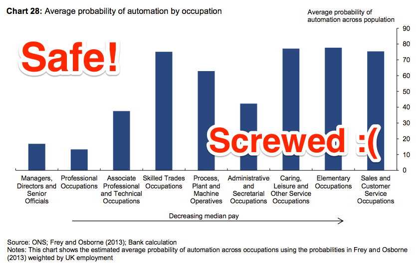
The threat is real, as this chart showing the rise and fall of various jobs historically shows. Agricultural workers were replaced largely by machinery decades ago. Telephonists have only recently been replaced by software programmes. This looks like good news for accountants and hairdressers. Their unique skills are either enhanced by software (accountants) or not affected by it at all (hairdressers).

The BBC website contains a handy algorithm for calculating the probability of your job being robotised. For an accountant, the probability of vocational extinction is a whopping 95%. For a hairdresser, it is 33%. On these numbers, the accountant’s sun has truly set, but the relentless upwards ascent of the hairdresser is set to continue. For economists, like me, the magic number is 15%.

Another data analysis about jobs which will be phased out as time goes. It is an interesting analysis of historical job data. However, after I glanced through the bank report referenced in the article, I am not sure robots are the reason of the job replacement. For example, it could be replaced by cheap labor in foreign countries. The bank report shows only the jobs subject to be phased out due to technology advancement. People could just become productive. So, do not take robots too seriously!

Read more at The Bank of England has a chart that shows whether a robot will take your job

What do you think about this article? Share you opinions in the comment box and subscribe us to get updates.

Big data analytics technology: disruptive and important?

Of all the disruptive technologies we track, big data analytics is the biggest. It’s also among the haziest in terms of what it really means to supply chain. In fact, its importance seems more to reflect the assumed convergence of trends for massively increasing amounts of data and ever faster analytical methods for crunching that data. In other words, the 81percent of all supply chain executives surveyed who say big data analytics is ‘disruptive and important’ are likely just assuming it’s big rather than knowing first-hand.

Does this mean we’re all being fooled? Not at all. In fact, the analogy of eating an elephant is probably fair since there are at least two things we can count on: we can’t swallow it all in one bite, and no matter where we start, we’ll be eating for a long time.

So, dig in!

Getting better at everything

Searching SCM World’s content library for ‘big data analytics’ turns up more than 1,200 citations. The first screen alone includes examples for spend analytics, customer service performance, manufacturing variability, logistics optimisation, consumer demand forecasting and supply chain risk management.

Read more at Big data analytics technology: disruptive and important?

Share your opinions regarding this topic in the comment box below and subscribe us for more updates.

Data Lake vs Data Warehouse: Key Differences

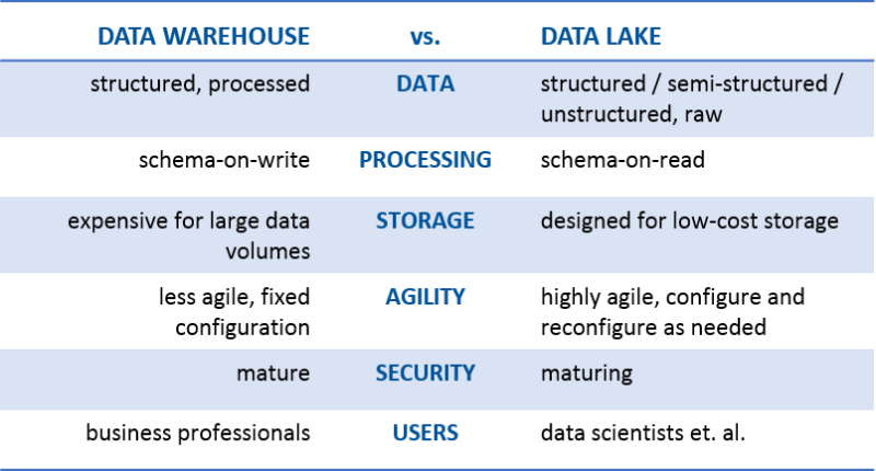
Some of us have been hearing more about the data lake, especially during the last six months. There are those that tell us the data lake is just a reincarnation of the data warehouse—in the spirit of “been there, done that.” Others have focused on how much better this “shiny, new” data lake is, while others are standing on the shoreline screaming, “Don’t go in! It’s not a lake—it’s a swamp!”

All kidding aside, the commonality I see between the two is that they are both data storage repositories. That’s it. But I’m getting ahead of myself. Let’s first define data lake to make sure we’re all on the same page. James Dixon, the founder and CTO of Pentaho, has been credited with coming up with the term. This is how he describes a data lake:

“If you think of a datamart as a store of bottled water – cleansed and packaged and structured for easy consumption – the data lake is a large body of water in a more natural state. The contents of the data lake stream in from a source to fill the lake, and various users of the lake can come to examine, dive in, or take samples.”

And earlier this year, my colleague, Anne Buff, and I participated in an online debate about the data lake. My rally cry was #GOdatalakeGO, while Anne insisted on #NOdatalakeNO. Here’s the definition we used during our debate:

“A data lake is a storage repository that holds a vast amount of raw data in its native format, including structured, semi-structured, and unstructured data. The data structure and requirements are not defined until the data is needed.”

Read more Data Lake vs Data Warehouse: Key Differences

What do you think about this topic? Share your opinions below and subscribe us to get updates in your inbox.


INFO GRAPHICS WITH EXCEL

I’m not always the biggest fan of info graphics. Many of the posters-sized info graphics released these days have issues. But lately I’ve also received several requests on how to do info graphics with Excel. Many people don’t know where to start.

How Info Graphics are Different
Info graphics differ somewhat from your usual dashboard-style reporting. When we report with business tools, we use the data points–charts, tables, etc–to investigate a problem or monitor a system. That is, we use data to find results. Info graphics are used when we already know the results and we want to present it in an interesting, sometimes even artistic, way. Info graphics, then, are more about style and appearance–they wouldn’t necessarily find a good home on a dashboard. But they do work well in magazines, newspapers, and some student projects.

Info Graphics and Excel
Many info graphics are made with graphic editing programs like Adobe Illustrator. As far as I know, these illustrations are static. So each change in the underlying data won’t be automatically updated in the graphic. You would just have to redraw the graphic. Excel provides a benefit here: if we use Excel’s charts to make our info graphics, we can update the underlying data and the result appears automatically.

Read more at INFO GRAPHICS WITH EXCEL

Write your opinions about this article below and subscribe us for the latest article in your inbox.

Six signs that your Big Data expert, isn’t

big-data-iceberg-napkin-21-608x608

This is so far the best article that I have been reading about the Big Data. It is what I have been advocating to people.

1. They talk about “bigness” and “data,” rather than “new questions”

… It seems most of the tech industry is completely drunk on “Big Data.”

… most companies are spending vast amounts of money on more hardware and software yet they are getting little, if any, positive business value.

… “Big Data” is a terrible name for the revolution going on all around us. It’s not about Bigness, and it’s not about the Data. Rather, it’s about “new questions,” being facilitated by ubiquitous access to massive amounts of data.

… If all you’re doing is asking the same old questions of bigger amounts of the same old data, you’re not doing “Big Data,” you’re doing “Big Business Intelligence,” which is itself becoming an oxymoron.

Continue reading

Firms may violate workers’ medical privacy with big data

stat

It may be time to take a step back and re-evaluate how U.S. companies are using big data gathered in employee wellness and other health care analytics programs.

… In an editorial posted Tuesday in JAMA Internal Medicine, some Texas researchers argue that use of big data to predict the “risk” of a woman getting pregnant may be crossing a line. It could exacerbate long-standing patterns of employment discrimination and paint pregnancy as something to be discouraged.

… The concern arose after reports of how one health care analytics company launched a product that can track, for example, if a woman has stopped filling birth-control prescriptions or has searched for fertility information on the company’s app. And women may not even be aware that such data is being collected.

… About half of large firms that provided health benefits to employees in 2015 either offered or required that they complete health risk assessments or undergo biometric screenings, according to a recent analysis. Corporate wellness services is a booming industry generating annual revenue of about $1.8 billion.

Read more at Firms may violate workers’ medical privacy with big data

Should you have any questions, contact us for discussion or leave your comments below.

Supply Chain & Big Data ÷ Analytics = Innovation

Google the term “advanced analytics” and you get back nearly 23 million results in less than a second.

Clearly, the use of advanced analytics is one of the hottest topics in the business press these days and is certainly top of mind among supply chain managers.

Yet, not everyone is in agreement as to just what the term means or how to deploy advanced analytics to maximum advantage.

At HP, the Strategic Planning and Modeling team has been utilizing advanced operational analytics for some 30 years to solve business problems requiring innovative approaches.

Over that time, the team has developed significant supply chain innovations such as postponement and award winning approaches to product design and product portfolio management.

Based on conversations we have with colleagues, business partners and customers at HP, three questions come up regularly – all of which this article will seek to address.

  1. What is the difference between advanced and commodity analytics?
  2. How do I drive innovation with advanced analytics?
  3. How do I set up an advanced analytics team and get started using it in my supply chain?

Advanced analytics vs. commodity analytics

So, what exactly is the difference between advanced analytics and commodity analytics? According to Bill Franks, author of “Taming The Big Data Tidal Wave,” the aim of commodity analytics is “to improve over where you’d end up without any model at all, a commodity modeling process stops when something good enough is found.”

Another definition of commodity analytics is “that which can be done with commonly available tools without any specialized knowledge of data analytics.”

The vast majority of what is being done in Excel spreadsheets throughout the analytics realm is commodity analytics.

Read more at Supply Chain & Big Data ÷ Analytics = Innovation

What do you think about this topic? Write down your opinions in the comment box below, and subscribe us to get updates in your inbox.

What’s the Difference Between Business Intelligence (BI) and EPM?

Business Intelligence Emerges From Decision Support

Although there were some earlier usages, business intelligence (BI) as it’s understood today evolved from the decision support systems (DSS) used in the 1960s through the mid-1980s. Then in 1989, Howard Dresner (a former Gartner analyst) proposed “business intelligence” as an umbrella term to describe “concepts and methods to improve business decision-making by using fact-based support systems.” In fact, Mr. Dresner is often referred to as the “father of BI.” (I’m still trying to identify and locate the “mother of BI” to get the full story.)

The more modern definition provided by Wikipedia describes BI as “a set of techniques and tools for the acquisition and transformation of raw data into meaningful and useful information for business analysis purposes.” To put it more plainly, BI is mainly a set of tools or a platform focused on information delivery and typically driven by the information technology (IT) department. The term “business intelligence” is still used today, although it’s often paired with the term “business analytics,” which I’ll talk about in a minute.

Along Came Enterprise Performance Management

In the early 1990s, the term “business performance management” started to emerge and was strongly associated with the balanced scorecard methodology. The IT industry more readily embraced the concept around 2003, and this eventually morphed into the term “enterprise performance management” (EPM), which according to Gartner “is the process of monitoring performance across the enterprise with the goal of improving business performance.” The term is often used synonymously with corporate performance management (CPM), business performance management (BPM), and financial performance management (FPM).

Read more at What’s the Difference Between Business Intelligence (BI) and EPM?

Contact us if you have any questions or share it in the comment box below.